Challenge
- Develop a user-friendly website for Cruise-life customers.
- Enhance user experience and improve usability.
- Create an elegant and user-friendly website.
- Differentiate from competitors and stand out in the market.
Solution
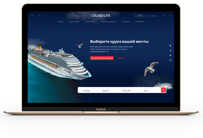
We developed a modern website for existing and potential Cruise-Life.PRO customers, providing quick and easy access to all of the company’s services. Users can effortlessly search for their dream cruise, register, and make payments. The site also allows users to stay updated with the latest news and discounts from cruise companies.


Analysis
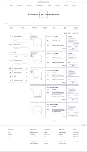
We conducted a competitive analysis, identifying the strengths and weaknesses of the client’s website. To understand the target audience and address user concerns, we developed a Customer Journey Map (CJM). Following this research, we designed the interface structure for the future website using wireframes.
Comparison
Main


Cabin selection


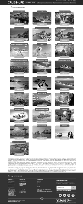
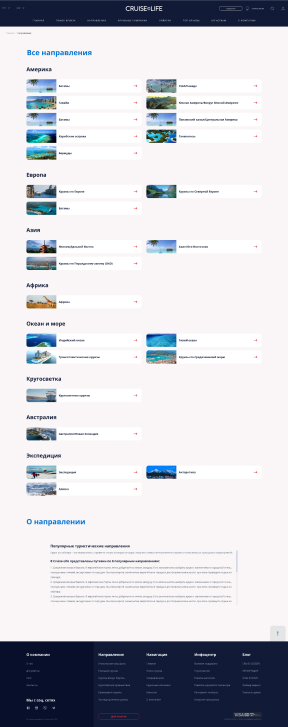
Directions
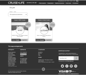
Discounts
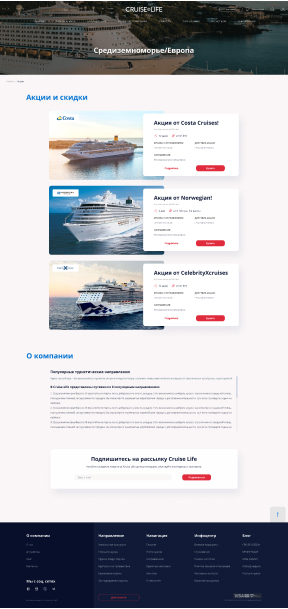
Search
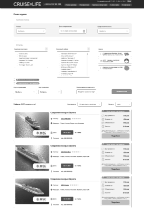
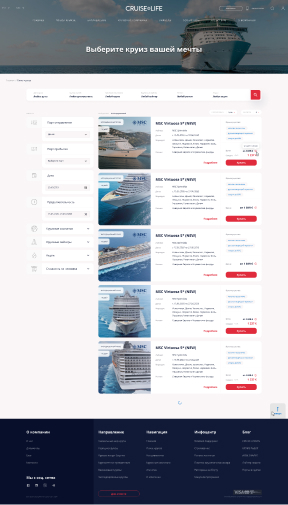
Cruise selection
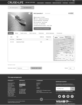

Design difference Before and After
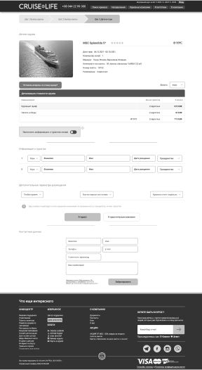
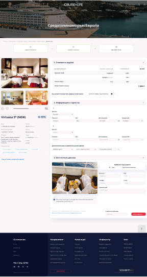
Throughout our work, we identified challenges and inconveniences faced by users attempting to purchase a cruise. The site contained a large volume of information that needed to be consolidated, organized, and streamlined for a better experience. You can track the progress of our work and see the differences between the old and new design.
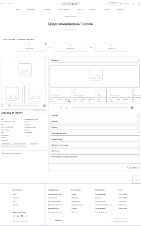
Tour details
Conception
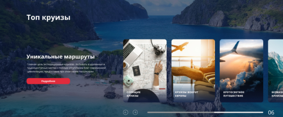
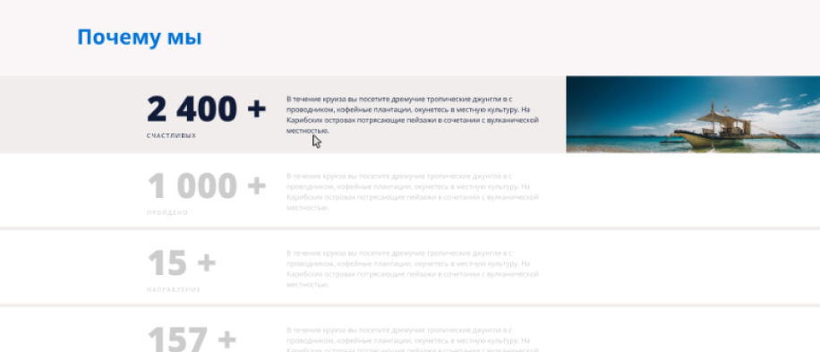
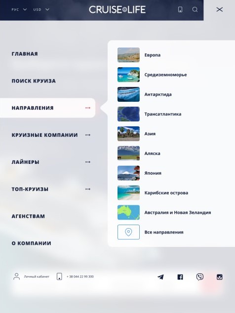
The site features a block-based design that optimizes the use of space. The main navigation panel divides content into key sections, each with sub-sections, enabling visitors to quickly locate the information they need.
Cruises


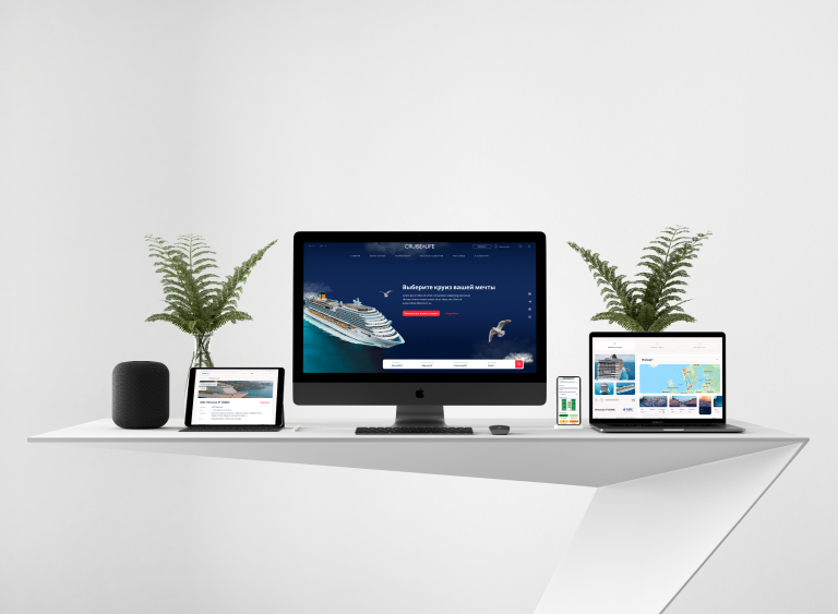
Adaptive web design
The site is fully optimized for flawless performance across all devices.
Features were imlemented


Menu
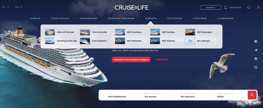
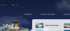
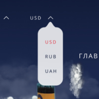
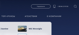
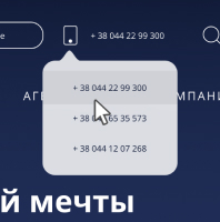
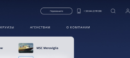
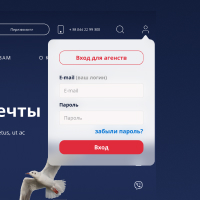
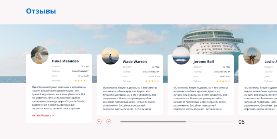
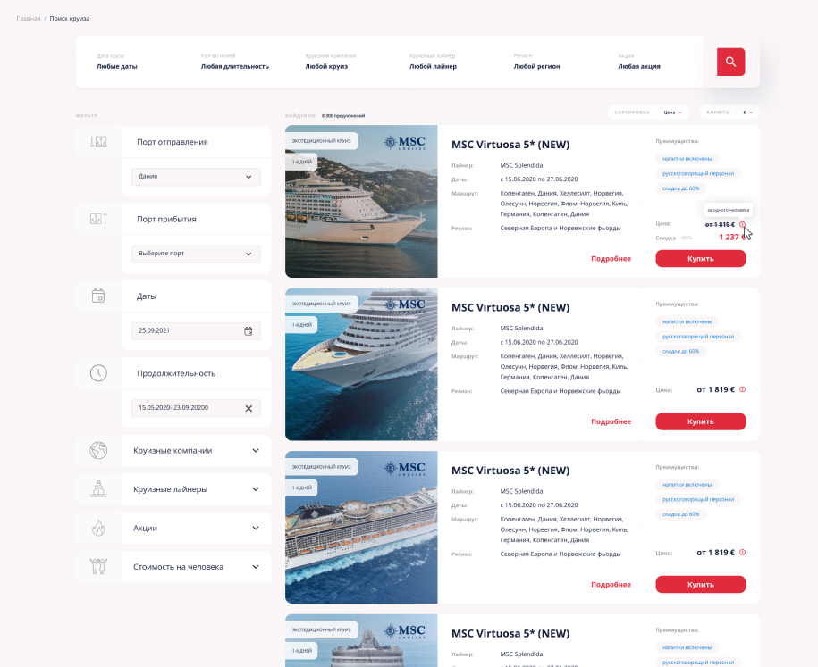
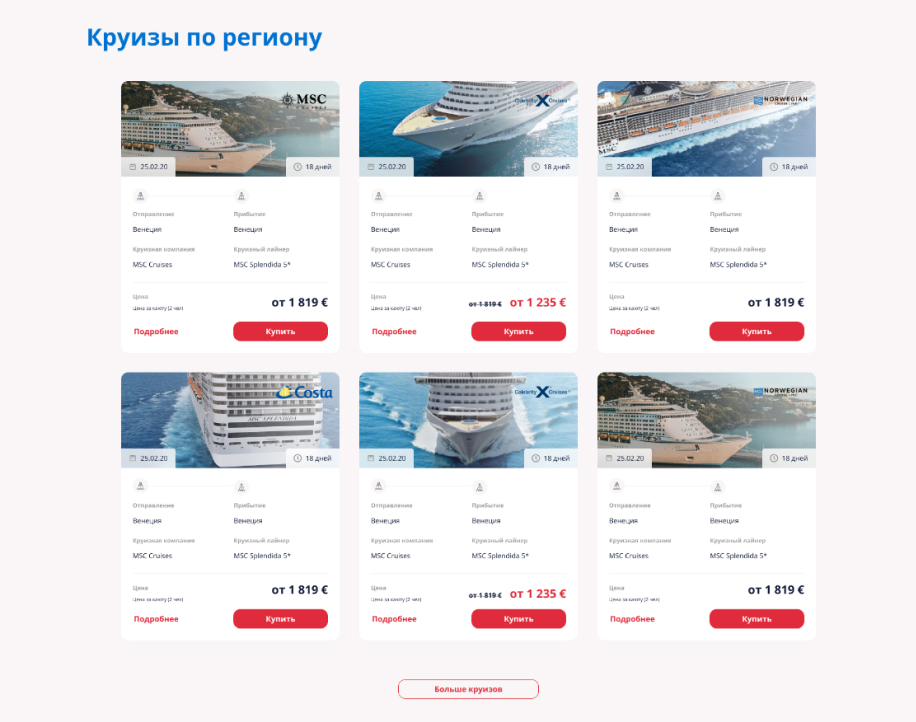
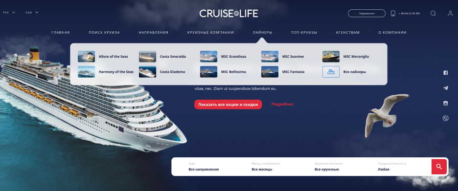
We enhanced the site by adding language and currency management options to the menu, making it more user-friendly. Users can log in to their accounts for a personalized experience. For additional support, we introduced an automatic callback feature and direct calling options to connect with a manager. We also implemented a convenient site-wide search, created a light and airy interface, and removed heavy colors for a cleaner look.
Liners
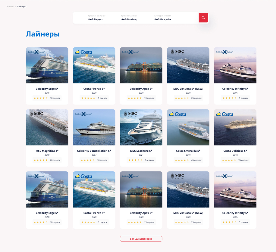
We created a dedicated page for cruise liners to simplify the selection of cruise companies, focusing only on the most essential functions for the user.

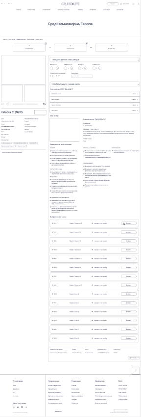
Deck and cabins
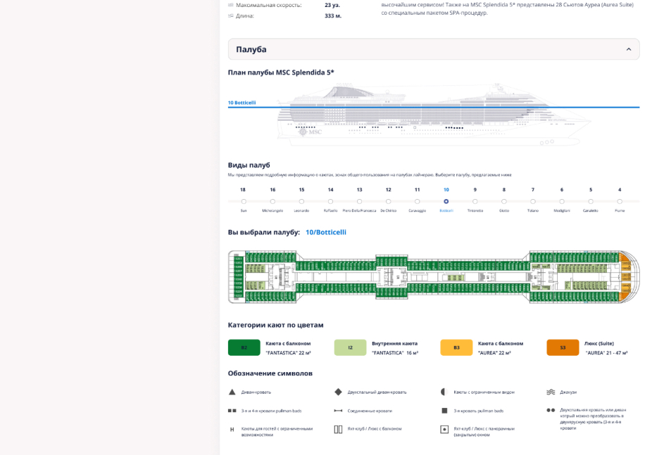
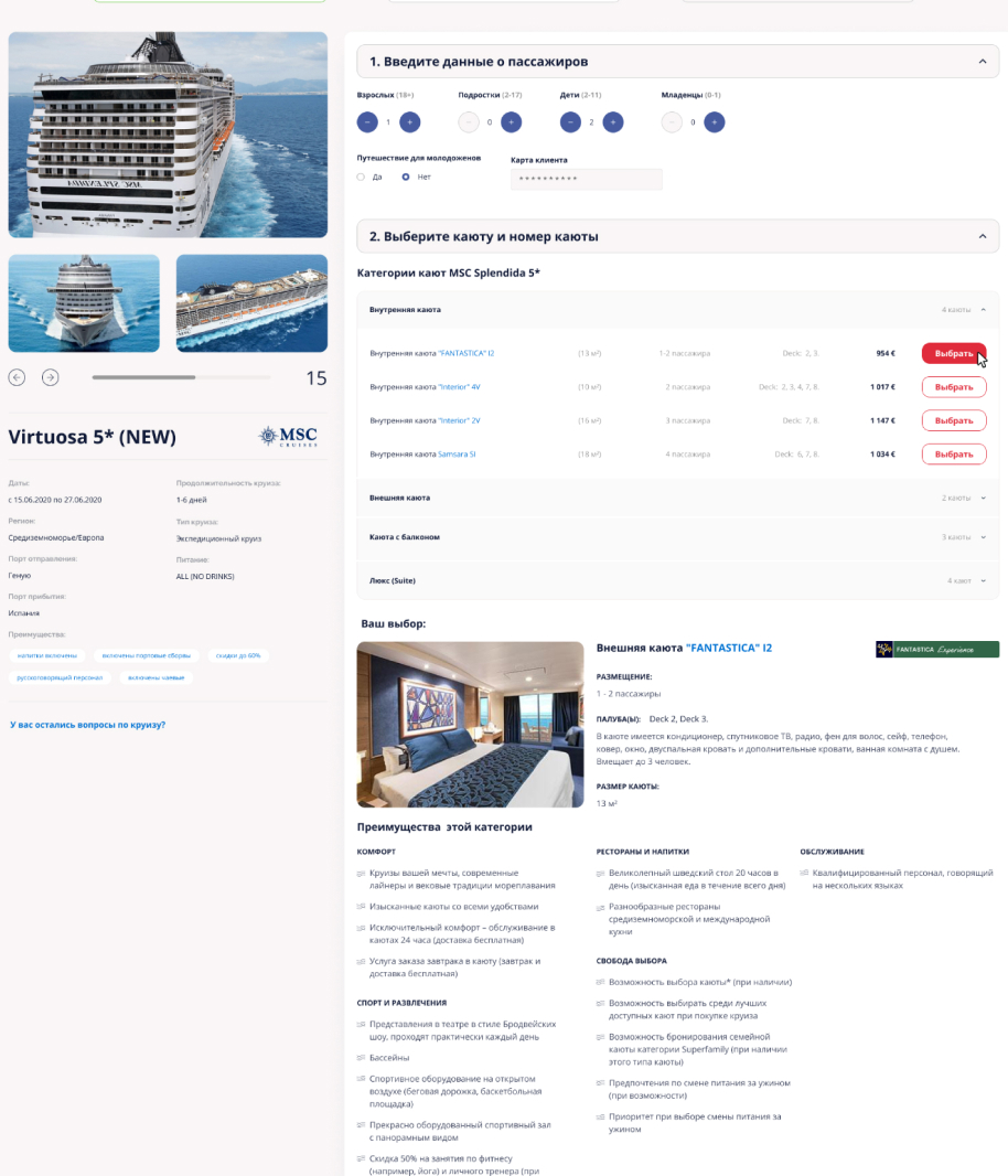
The site allows users to explore different decks, from 1 to 13, and view various cabin options, ranging from interior cabins to suites with different rates. We designed the interface to be clean, intuitive, and user-friendly, providing familiar and easy-to-use functionality for a seamless experience.
Results
As a result of our work, we developed a functional and user-friendly website for Cruise-Life.PRO, enhancing brand recognition, attracting new customers, and positively impacting the company’s image. The site also helps maintain interest among existing customers and improves the overall quality of customer service.


